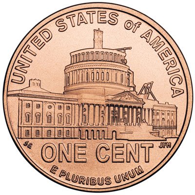
The fourth and final reverse design for the series of four 2009 Bicentennial Lincoln Cents represents Lincoln’s Presidency in Washington, D.C. (Buy on eBay) Chronologically, this covers the final years of his life from 1861-1865.

The reverse depicts the United States Capitol Dome, which is half completed. This is intended to represent the unfinished business of a Nation torn apart by the Civil War. The inscriptions on the reverse read “E Pluribus Unum”, “United States of America”, and “One Cent”. This reverse was designed by Susan Gamble and sculpted by Joseph Menna.
The coin was first released into circulation on November 12, 2009. On the same date, an official launch ceremony was held in Washington, DC at the Ulysses S. Grant Memorial Statue. Amidst inclement weather, approximately 200 people attended the ceremony. During this event, the design for the 2010 Lincoln Cent was unveiled for the first time.
See also:
- Reverse Design #1 – 2009 Birthplace Lincoln Cent
- Reverse Design #2 – 2009 Formative Years Lincoln Cent
- Reverse Design #3 – 2009 Professional Life Lincoln Cent


Woah! I’m really loving the template/theme of this site. It’s
simple, yet effective. A lot of times it’s challenging to get that
“perfect balance” between user friendliness and appearance.
I must say that you’ve done a awesome job with this.
In addition, the blog loads very quick for me on Internet explorer.
Exceptional Blog!
Why users still use to read news papers when in this technological world everything is presented on web?
Hi! I’m at work browsing your blog from my new iphone 3gs!
Just wanted to say I love reading your blog and look forward to all your posts!
Carry on the great work!
I for all time emailed this blog post page to all my friends, because if like to read it next my friends will too.
Hey! This is my 1st comment here so I just wanted to give a quick shout out and tell you I genuinely enjoy reading
through your blog posts. Can you recommend any other blogs/websites/forums that go over the same subjects?
Appreciate it!
I was curious if you ever thought of changing the structure
of your website? Its very well written; I love what youve got to say.
But maybe you could a little more in the way of content so
people could connect with it better. Youve got an awful
lot of text for only having 1 or 2 pictures. Maybe you could space
it out better?
order androxal cheap uk
online order androxal uk london
buying enclomiphene no prescription mastercard
buy cheap enclomiphene cost insurance
get rifaximin cheap mastercard
buy cheap rifaximin buy hong kong
purchase xifaxan price from cvs
cheap xifaxan generic online buy
get staxyn cheap prescription
cheap meds staxyn
buying avodart generic version
buy avodart low cost
online order dutasteride american express
get dutasteride generic form
buy cheap flexeril cyclobenzaprine cheap with fast shipping
discount flexeril cyclobenzaprine cost uk
how to buy gabapentin purchase usa
sex pills gabapentin
ordering fildena australia online no prescription
online order fildena generic form
itraconazole no doctors consult
buy itraconazole generic uk
kamagra porovnat ceny walgreens
kamagra bez lékařského předpisu a doručeno přes noc
kamagra livraison livraison le lendemain
medicament kamagra acheter bon marche